
David P. Best
Reinterpreting the American Farmhouse


This is the narrative of a significant renovation project that constituted a key element in my family's aspiration to embark on a new chapter in the rural hills of Virginia. I am sharing it here to chronicle this phase – a further testament to my commitment to design and craftsmanship. The entire endeavor unfolded over 18 months and was a collaborative effort between my wife at the time – the exceptionally talented Interior Designer Kathy Geissler Best – and myself.
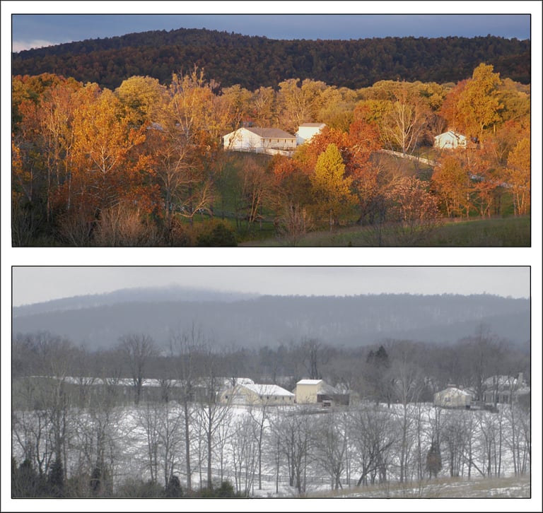
We purchased a 70-acre farm in a village called Keswick outside of Charlottesville, in a place we knew little about. In retrospect, we were blind to the enormity of the risks, but steadfast in our dedication to bring about a lifestyle change. The goal was to give the kids exposure to a rural life, and "re-pot" in a new community outside the urban demands of the city of San Francisco. What follows is a brief synopsis of how the farmhouse aspects evolved through the renovation and expansion.
This was an ambitious project that included additions to, and the total renovation of the main residence, in addition to new water wells, septic fields, power lines, in-ground propane tanks, a motor-generator backup power system, extensive landscape revisions, and the installation of a Provençal garden and countless new trees. The 1911 farmhouse, situated on 70-acres, needed considerable revision, yet the architectural style suggested an expansion and general aesthetic upgrade without casting aside the farmhouse character with its wrap-around porch. The original rooms of the farmhouse were functional and provided beautiful vistas of the surrounding area.
Reinterpreting the American Farmhouse
Scope of project
The renovation included the removal of nearly 500 square feet of ill-conceived additions, and the addition of just over 1000 square feet of new space, including a Master Suite, powder room, and fourth bedroom upstairs, bringing the total living area to approximately 4,000 square feet. The new Master Suite includes a bath, walk-in closet, sitting area and screened porch.
One challenge was to make the new section look as though it belonged to the original structure, both inside and out. With every design decision, we considered the objective: retain the “farmhouse” character. Just one example of this involved the brass hinges on the interior doors. Although much of this brass hardware was replaced with new, we decided to strip the new brass of the clear lacquer finish and allow it to tarnish – making it appear to be original.
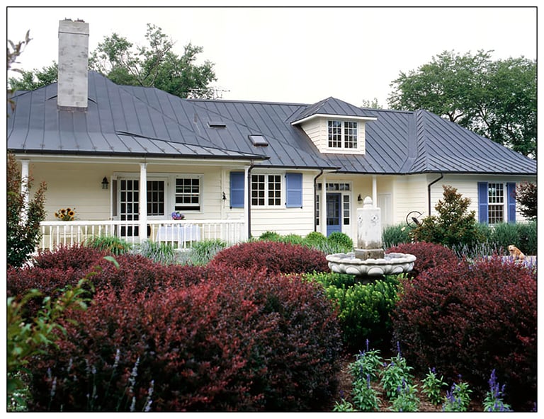
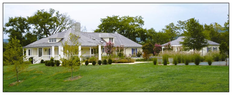
On the exterior, we liked the uniqueness of the roofline and decided to accentuate and refine it by adding a standing-seam copper roof, while retaining the overall roof pitch and outline. The original four rooms of the house were returned to the 1911 floor plan, turning one of the rooms into a library with coffered ceilings. All the major systems (electrical, plumbing, HVAC, and septic) were replaced and a true chef’s kitchen was integrated into the design.
In addition to reconfiguring the floor plan of the main house, and a challenging renovation, the interior design treatments were an important and integral part of the overall concept. A mixture of French collectibles and art, combined with American colors, fabrics, and furniture were employed. The Library incorporated inside folding shutters for light control. On the exterior – to help with heat and light - operable wooden shutters were used with custom-made iron hinges and hold-backs similar to those found throughout Europe. This necessitated the design of a unique window screen system that allowed the exterior shutters to be opened or closed from within the building. The interior design combined furniture from the era of the house (Mackintosh, Wright, Saarinen, and Stickley) with contemporary pieces, and we pumped up the overall freshness with the use of color.
The photos below provide details on several of the rooms, and two aerial images taken eighteen months apart – the winter before the remodel began, the property as it neared completion. As you can see from the aerial photos, the project involved re-routing the driveway as well as significant landscaping.
Aerial View - Before Construction
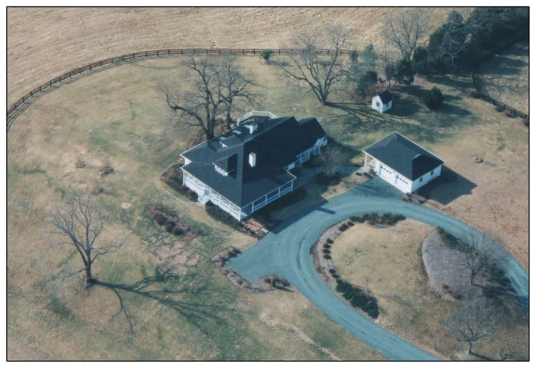

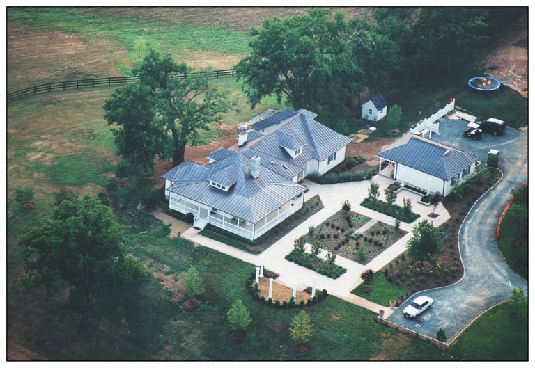

Ariel View - Nearing Completion
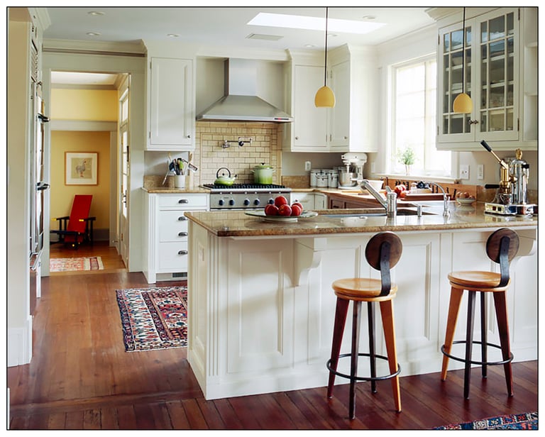

The Kitchen was completely gutted and redesigned. To maintain the farmhouse look, the cabinets were designed with 1920’s period detailing. The countertops are granite. Under the window is a meal preparation station with a quarter-sawn maple countertop. The electric oven and gas cooktop are by Thermador; the tile backsplash is Waterworks Olde Court Tiles with Chicago Faucets pot filler. The sink and filtered hot/cold water dispenser are by Franke with a HansaAmerica Hansaronda faucet; the refrigerator is by Sub Zero; the stools are from De Sousa Hughes. We added an opening skylight for ventilation and natural light.
Kitchen
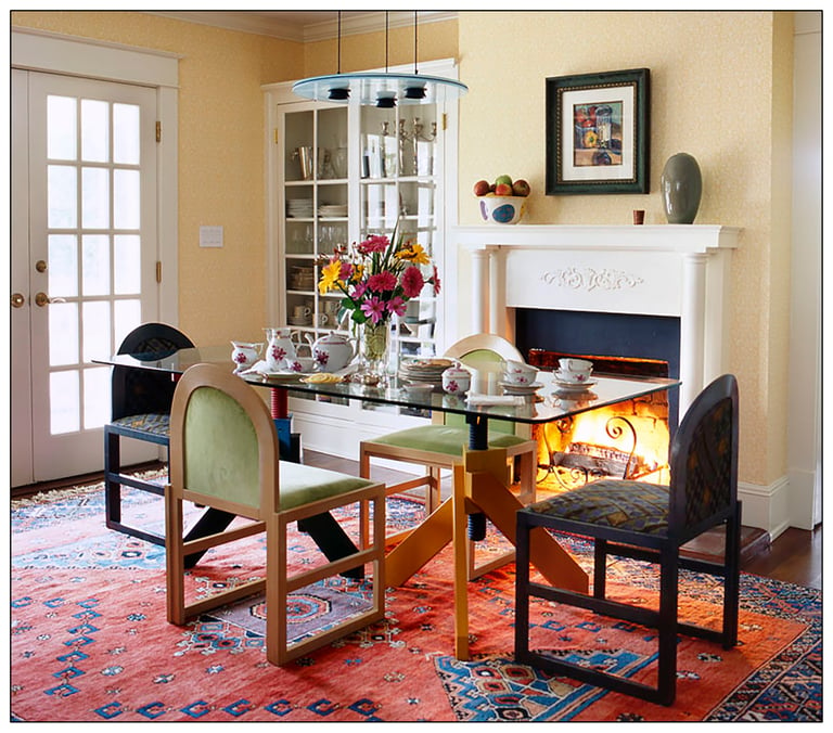

The breakfast area is adjacent to the kitchen. An original built-in cabinet and fireplace were kept for their historic charm. The fireplace chimney was rebuilt from the mantle up for safety reasons. The table pedestals are Italian from Limn, and wallpaper Lee Jofa. Most of the windows in the house were replaced with Marvin products, exterior doors by Pella and interior doors by Gaston & Wyatt. All screens for the house were replaced with hand-stretched bronze mesh - less visible than galvanized or aluminum.
Breakfast Area

Library
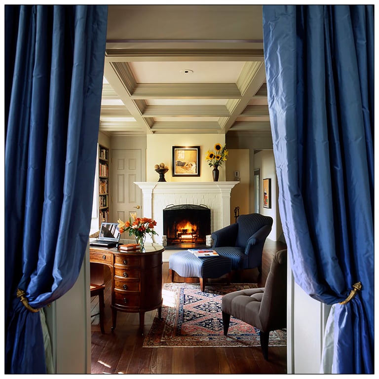
A warren of little rooms were combined to create a gracious library with a coffered ceiling. The fireplace mantle and surround were redesigned and replaced, and extensive book shelving was added with interior wooden shutters for light control. The floors are original to the house - longleaf wide-plank pine. Parterriers are made of taffeta silk from Dogwood; the gold hold-backs are from a Paris antique shop. The lounge chair is Donghia Luciano covered in Hines and Co. fabric. The painting over the new fireplace mantel is by artist Philip Geiger, and the custom fireplace screen was custom fabricated by a local blacksmith. The paint is Martin Senour drawn from historical colors at Colonial Williamsburg, bookcases and trim Pelham Grey Light, fireplace Everard Chamber White, ceiling Palace Ballroom Ceiling White.
Master Suite
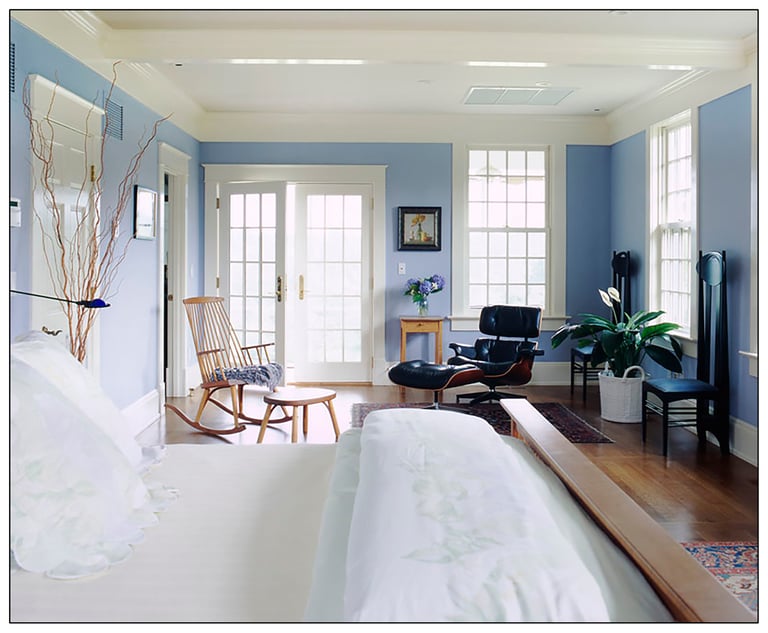

This section of the house is a new addition to the west end of the original structure and includes a large bedroom with a seating area, extensive walk-in closets, bath and private screened porch. Beams were added to the ceiling which were mimicked in the direction of the flooring to give spatial definition to the sitting area. The furnishings include Macintosh Argyle teahouse chairs, Eames Lounge chair, and a painting by Collene Cox. The bed is from the Baker Knapp & Tubbs Stickley collection; the linens are by Yves Delorme. The wall paint is Victorian Trim by Benjamin Moore.
Master Bath
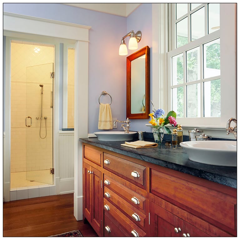

The Master Bathroom was completely replaced and updated with a classic look that still spoke of the farmhouse. The free-standing vanity cabinet was one of my shop projects and was made of hand-rubbed Pennsylvania cherry and features traditional raised panel doors, and dovetailed drawers with Häfele full-extension slides to ensure practicality. The hardware on the vanity is nickel plated by Horton Brass. The polished nickel faucets are Julia by Waterworks; the sinks are by American Standard. The countertop, tub surround, and shower shelf are Vermont soapstone. The towels are by Frette found in Florence.
Music Room
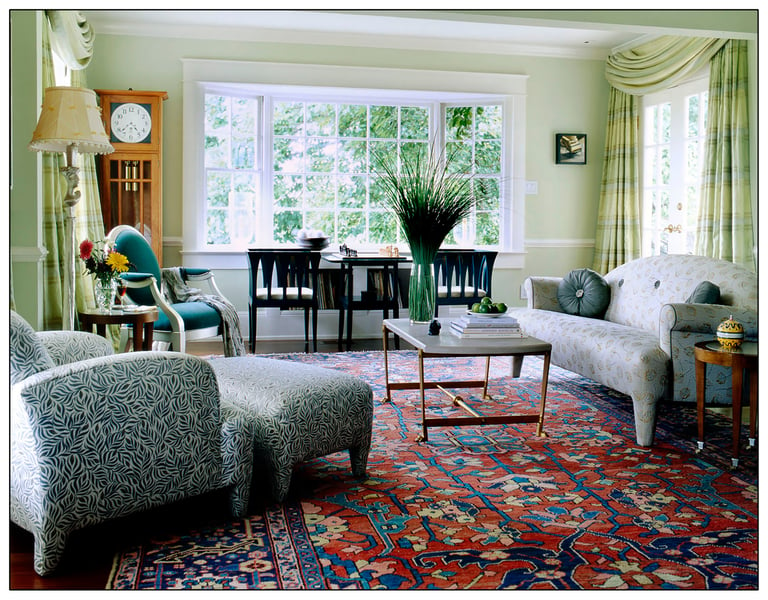

This is one of the four original rooms of the farmhouse and functions as the main living room. The decor features a custom-designed sofa made by Kroll Furniture Inc. with Pollack fabric, Eero Saarinen Blue table and chairs, Donghia Grande Soleil and an antique Sarapi rug. The wall color is Russell House Green Light by Martin Senour; the ceiling is Palace Ballroom Ceiling White, also by Martin Senour which helped to visually increase the room height.
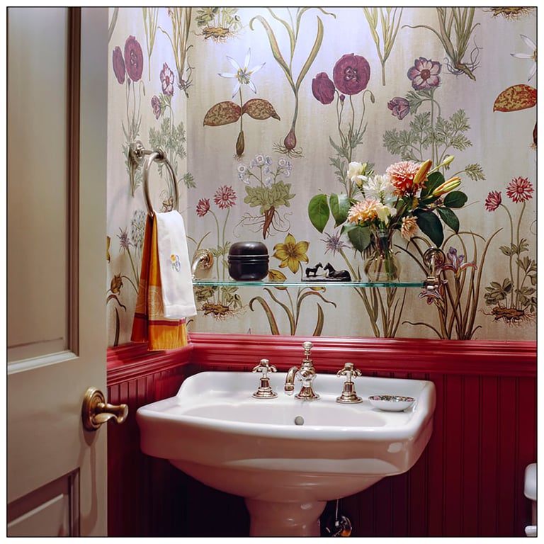

In keeping with the period nature of the farmhouse, the guest Powder Room was implemented with bead-board and wainscot, painted a rich dusty rose color, and the walls covered with floral wallpaper by Scalamandré, reminiscent of the French-inspired garden. The faucet is polished nickel from France. The faucets and pedestal sink were supplied by Waterworks.
Powder Room
Exterior Views
